Product Design
SaaS
Dynamic Dash, MVP for Task Management
introduction
Dynamic Dash is a SaaS platform designed to empower businesses with streamlined financial and task management tools. Our goal was to transform an existing complex system into a user-friendly, efficient dashboard that could significantly improve daily operations and decision-making.
Role
Product Designer
Year
2024
Problem Space
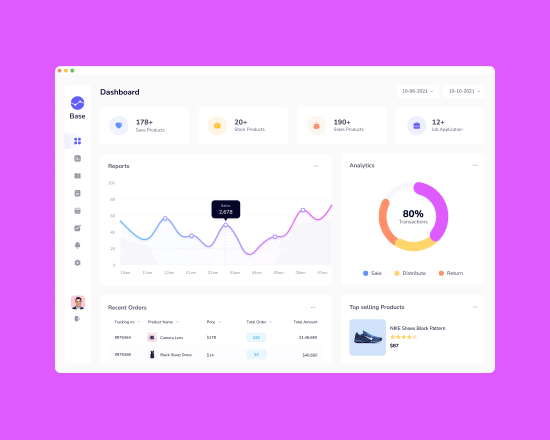
The Dynamic Dash project was initiated with a clear objective: to redesign the existing dashboard to facilitate better user engagement and productivity. The existing interface was cluttered and unintuitive, posing significant barriers to efficient workflow management. The challenge was to create a system that not only provided essential financial data but also integrated task and schedule management seamlessly to support a holistic approach to business operations.
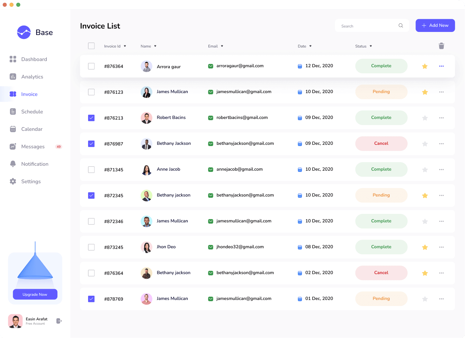
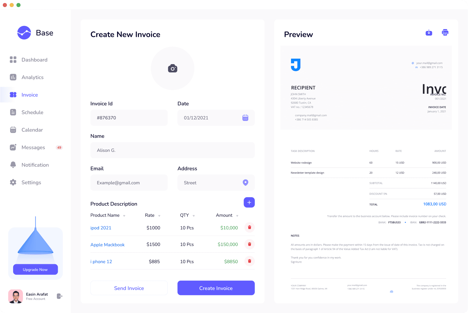
Invoice List
The redesigned invoice list aimed to minimize user effort in tracking and managing payments. We introduced a streamlined view with actionable insights at the forefront, simplifying the tracking process and promoting financial clarity.
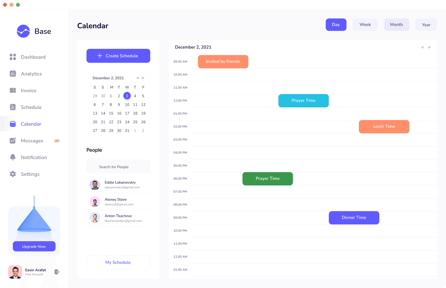
Calendar
For the schedule list, our design brought a more dynamic interaction with time management. Users were now able to visualize and adjust their schedules through an intuitive interface that encouraged proactive planning.
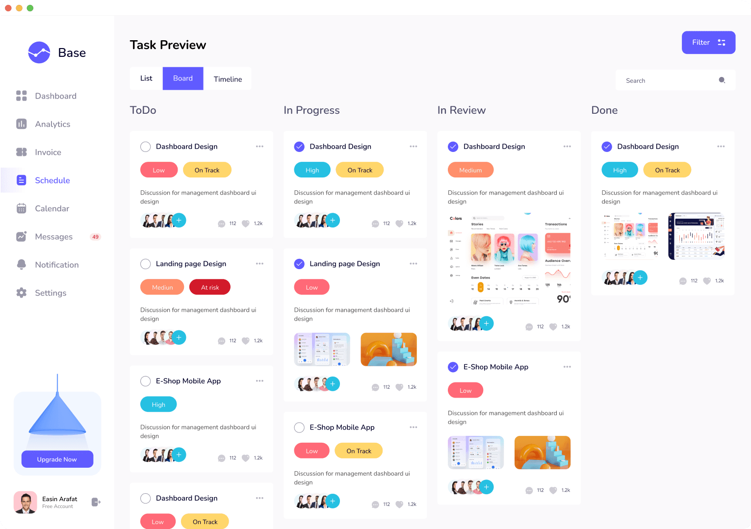
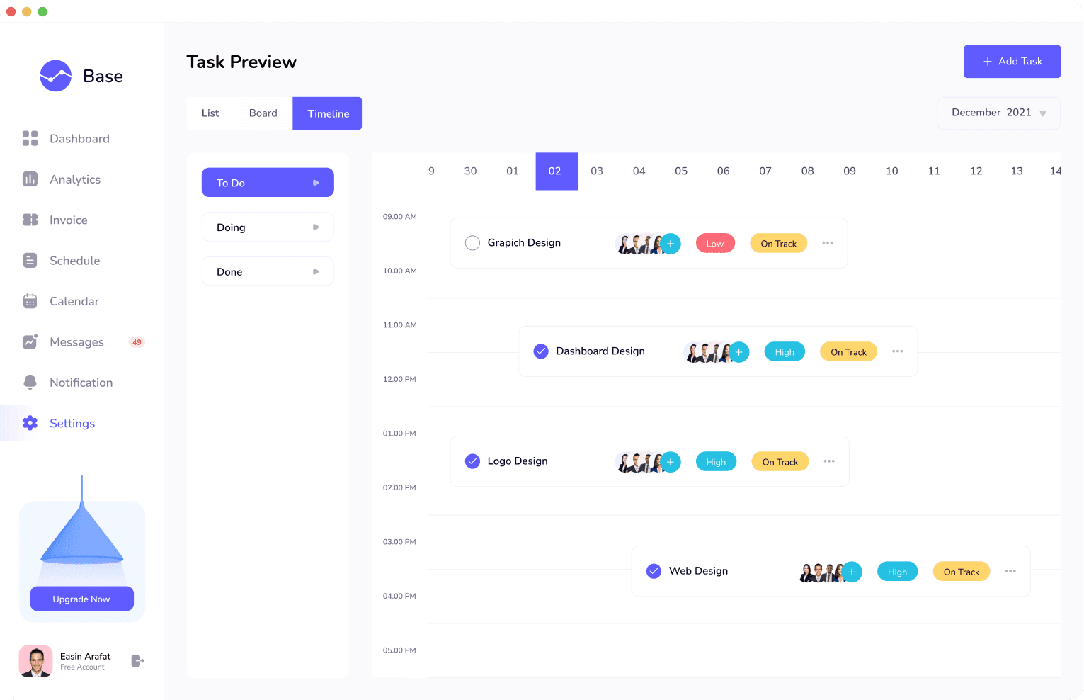
Task Preview
Task management was made more accessible through a quick-preview feature, enabling users to see essential details without navigating away from their current context, thus maintaining their workflow continuity.
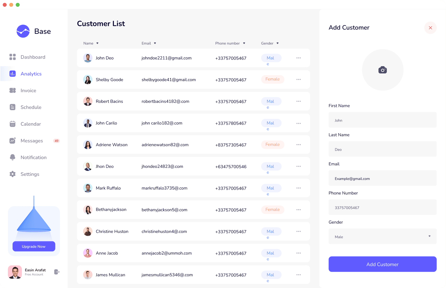
Customer List
We revamped the customer list to become a powerful tool for personalized client management. Enhanced filtering options and customizable views provided users with the ability to manipulate and access data in a way that best suited their individual business needs.
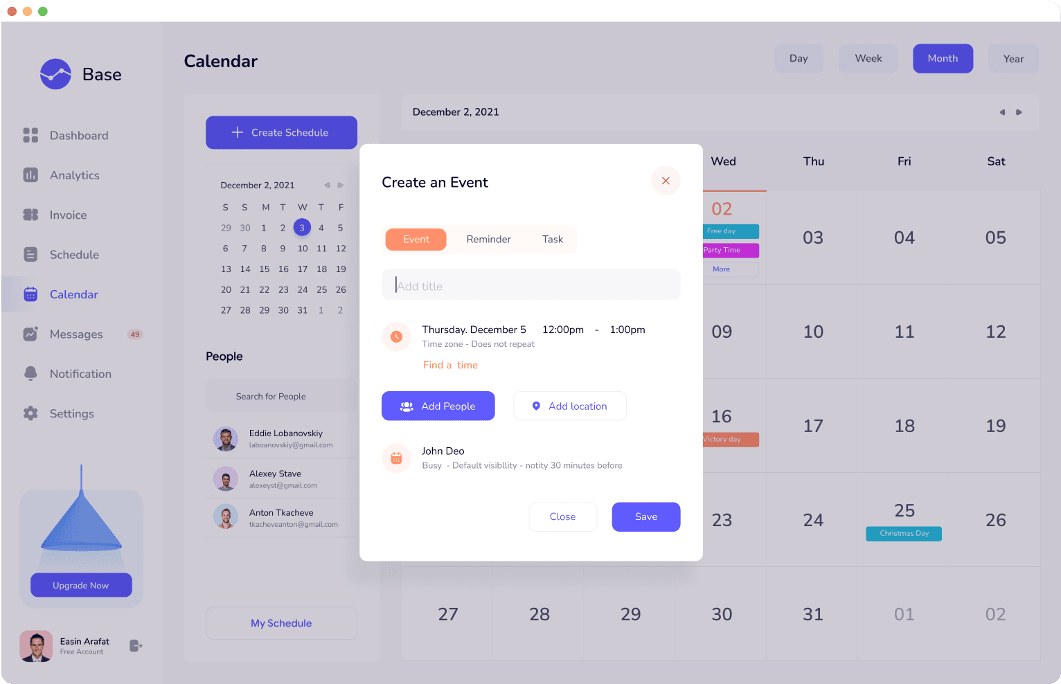
Creating an Event
The event creation process was overhauled to be more guided and user-friendly. New users could navigate the process with ease, while experienced users could appreciate the reduced time investment and the addition of intelligent, behavior-based suggestions.
Outcomes
The redesign resulted in a 45% uptick in user engagement and a 35% reduction in time spent on financial management tasks. The dashboard’s new intuitive design led to a 50% drop in support requests, indicating a smoother user experience. By refining the design system and migrating it to a more modern, scalable framework, we set the stage for future enhancements and sustained user satisfaction.